Design help – request for comments…
Design help – request for comments…
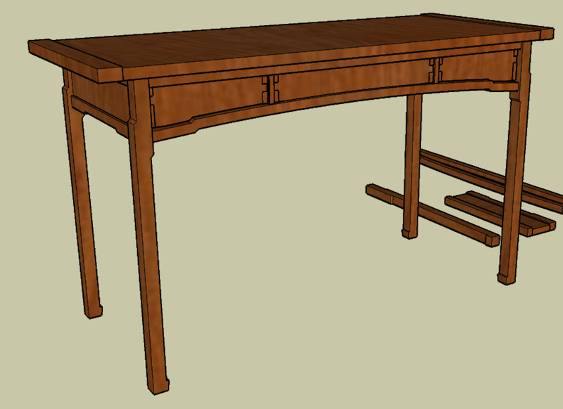
March 19, 2011 6 Comments on Design help – request for comments…This is a desk I started about 4 years ago. I have some of the parts roughed out and they’ve been collecting dust for about 3 years now. Part of the problem is that there are a couple of things that don’t “feel” right to me yet. Part of the plan was to field-engineer some modifications as it comes together and see what works firsthand.
The 3 years of stalling suggests that this was a bad plan. I’m looking to either get more confidence in this going forward or figure out what to tweak on it in sketchup. Please comment below with any design suggestions.
On the design – this design is inspired by the works of Michael Colca and Darrell Peart, whose designs are variations on Greene and Greene. The curved bottom greatly complicates things but it’s the part I most wanted to incorporate. My initial build is in beech as I figure things out, if it works I might redo it in other woods.
Please let me know what you think, whether a specific suggestion or just any part that bothers you. Every comment will help give this design some momentum in my shop.
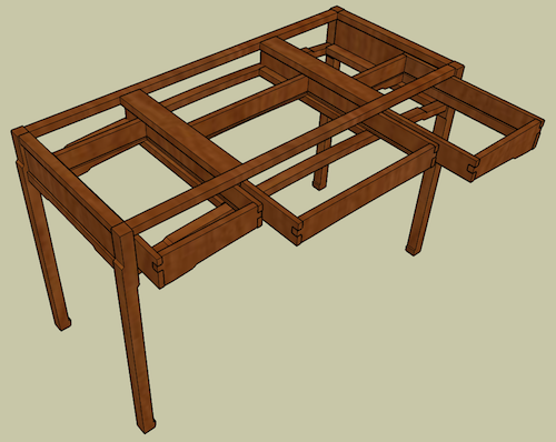
Just wanted to add a second view – here it is with the top removed and the drawers pulled out to show the skeleton.
Please note: for site management/spambot prevention, comments are moderated and ability to comment closes in 2 weeks.


6 Comments
Fantastic. It’s a great reflection on Greene and Greene. Very impressive.
Hi Cory, I know nothing about furniture design so feel free to ignore my comment. I like the Green and Green details and the overall design is cool. I’m just wondering if what you’re hedging on is the “lightness” of the piece. Wonder what it would look like with a little more heft: thicker, shorter legs; a little bit wider apron; and shorter table top. Could be I just like chunky furniture, I don’t know…
A couple of ideas for you:
– The breadboard ends don’t seem wide enough (left to right) for the total width of the top.
– Maybe it’s the perspective of the sketch, but something is a little off with the drawer finger joints. Maybe make the middle finger (no pun intended) a little larger across all the drawers?
– The legs are interesting. I’ve never seen a design like that before, so I’m curious how it will turn out in the material.
– If you wanted to do something a little different with the top, you could take the curved cloud lift from beneath the drawers and echo it on the front edge of the top.
Any ideas on what kind of drawer pulls you want to use?
Hi All, good comments.
Kari, the lightness used to bother me but at that time I played with it a little and I’m fine with it. The problem is the curve – fixing the middle being too light without the ends being too thick.
Torch02 – you’ve found one of the things thats bothered me – the top. That was one of the things I planned to re-engineer after building the rest so I can play with it full-scale. I think the breadboards will go away, and it might be a subtler version of that curve.
On drawer pulls, I think something simple, about 3-4″ long in the middle of the drawers, that follows the bottom curve.
The other thing that’s bothered me is curving the front without curving the sides – can I get away with that? Unfortunately if I do that it exposes the underneath drawer slides.
Wow. I love the top of the legs. The opposite step on each side is a great attention to detail.
Curious? What would happen if you dropped that step down the leg a bit so it’s inline with the bottom rails of the piece?
Then you could run a small chamfer on the rails that meets the small step/chamfer on the legs.
Gorgeous work, man.
I think you’ll be fine with the curve not extending to the sides. But if you wanted to extend it, you could have the “top” of the curve start at the front, curving down at a similar rate as the front curve, so that it finishes lower when it hits the back leg.
That would make it look like the curve was bent around the entire frame, instead of just repeated on the sides. Also, I think it might add the weight that Kari is looking for in the piece.